VINOVA
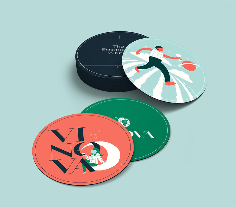
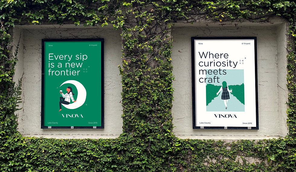
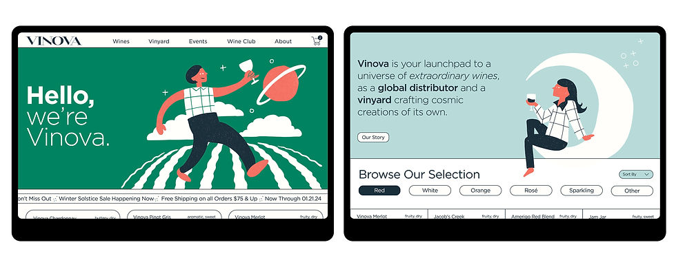
Vinova is a wine distribution company that offers unique global varietals and its own creations, blending discovery with refinement. Its brand invites wine lovers to explore a universe of flavors through a fresh, approachable lens.
I crafted Vinova’s identity with playful space-themed illustrations and aspirational copy, balancing sophistication and fun. This approach made the brand both engaging and memorable.
ROLE
Brand Designer
SERVICES
Brand Strategy, Visual Identity, UI/UX, Advertising, Social Media, Illustration


The Vinova logo text is based on the Mittwoch typeface, chosen for its graceful, elegant appearance and geometric, high-contrast letterforms.

The type logo's shape and line width are reflected throughout the brand in icons, borders, and patterns, reinforcing the core visual identity.


IN PRACTICE
My goal was to explore how the brand’s visual identity could be applied across various touchpoints. I infused a sense of curiosity through space-themed elements, inspiring a spirit of exploration and new horizons. The brand voice was crafted to be authentic and approachable, resonating with Vinova’s core audience while staying fun and inviting.


Deliverables, wine labels, and marketing materials are crafted on high-quality, textured paper with a heavy tooth, often featuring folds and unique finishes. This tactile approach reflects the handcrafted essence of the brand, complementing the illustration style and products they create.